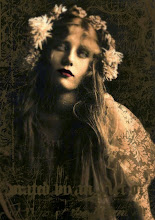
I have recently signed up for Kim Klassen's Photoshop Test Kitchen - button in my sidebar. If you love playing in Photoshop with textures and lots of how to's, tips and techniques, then this is the place for you. This is my first offering from the Test Kitchen - this has taken me ages and has got so many textures and elements in it, some courtesy of Kim and one of Christina Renee's glass negative frames.
Here is the original photo:-
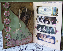
I have been trying to do one of the mosaic templates but am not happy yet with the final outcome but here is my first go at a new blog header - what do you think?


8 comments:
Hi,
This is something I'm interested in too, I really like the colors of your new blog color experiment, i know that much, that sort of buttery yellow is so rich.
xx
julie
Beautiful photoshopped image clever you!!
LOve the draft of your new header, I wasn't aware it was possible to DIY it. Maybe I can't do that as mine is a freebie ready made one....
Aren't Kim's inspiration and textures just the best?! Love what you've done with the flower and the rich warm tones in your mosaic templates! I haven't had as much time as I'd like to dig into all the materials in the Test Kitchen. It can be so addicting just to play with all the textures in PSE. Xo, Sue
Your dahlia piece is wonderful...you must be very pleased with it :-)
Great mosaic too (I'll go and answer your message now.....email on its way :-)
Linda x
just found your blog while searching for the photoshop test kitchen - love your work and your style - signed up to be a follower!
amy of four corners design
fourcornersdesign.blogspot.com
Your photos are lovely! I still don't have Photoshop, but I can't wait to learn soon!
It's lovely, but so is your current banner.
Hi Bunty,
It's always lovely to meet a fellow digital artist. If you feel like meeting a bunch of nice people who all like digital art, feel free to check out this group.
Greetings from Germany,
Birgit
Post a Comment